Turning a complex loyalty platform into something people actually enjoy using
Open Loyalty is a powerful platform with complex, high-stakes configuration workflows. Small UX issues can easily turn into real operational problems for loyalty teams, so improving the product meant going beyond “better screens” and owning the full cycle.
I took ownership of end-to-end product design improvements, supported by real usage insights (including Hotjar across multiple client instances). From research and benchmarking through prototyping, stakeholder alignment, and UX writing with domain experts, I shipped changes, validated them after release, and iterated to keep the platform improving over time.
Project summary
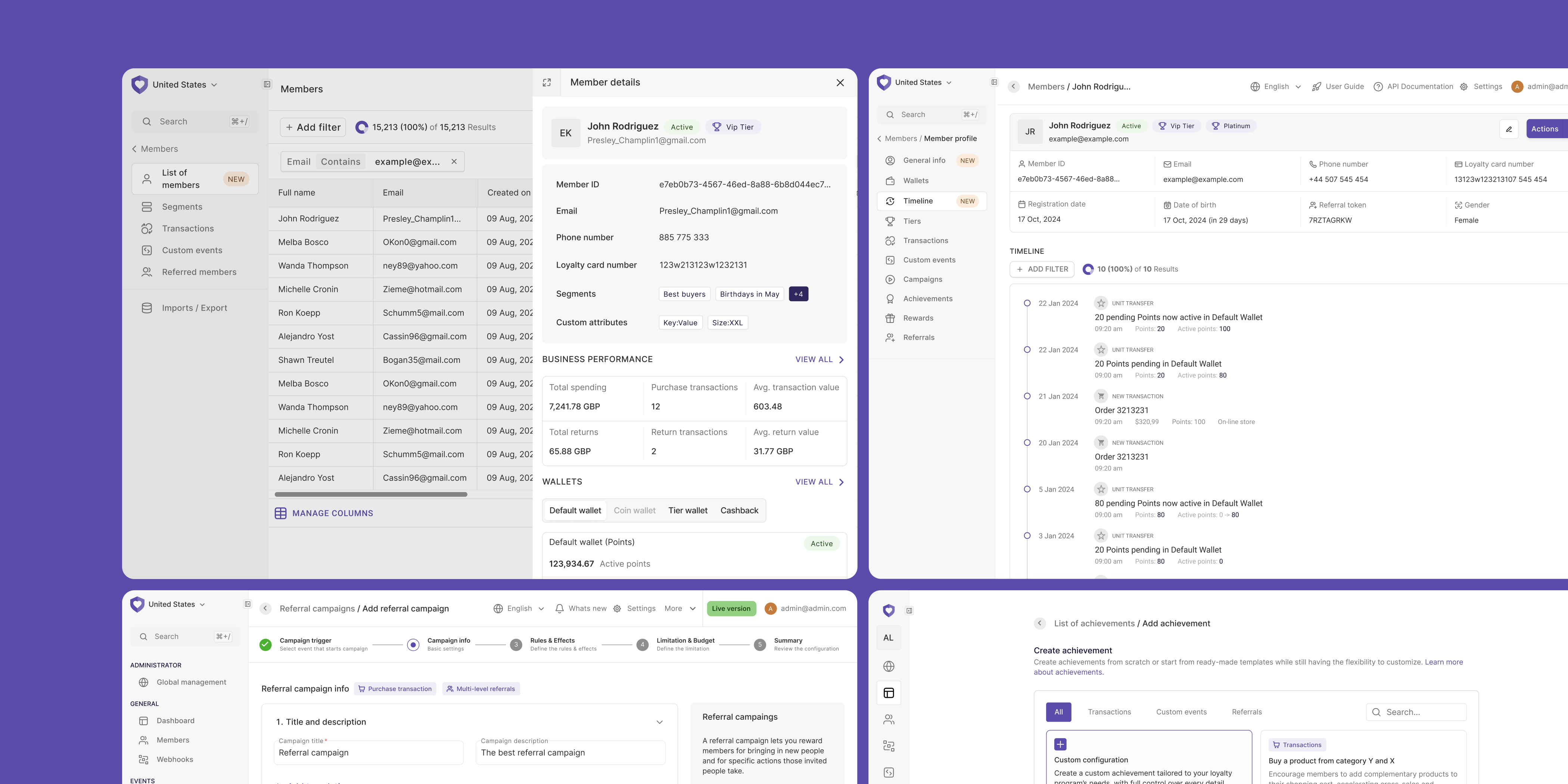
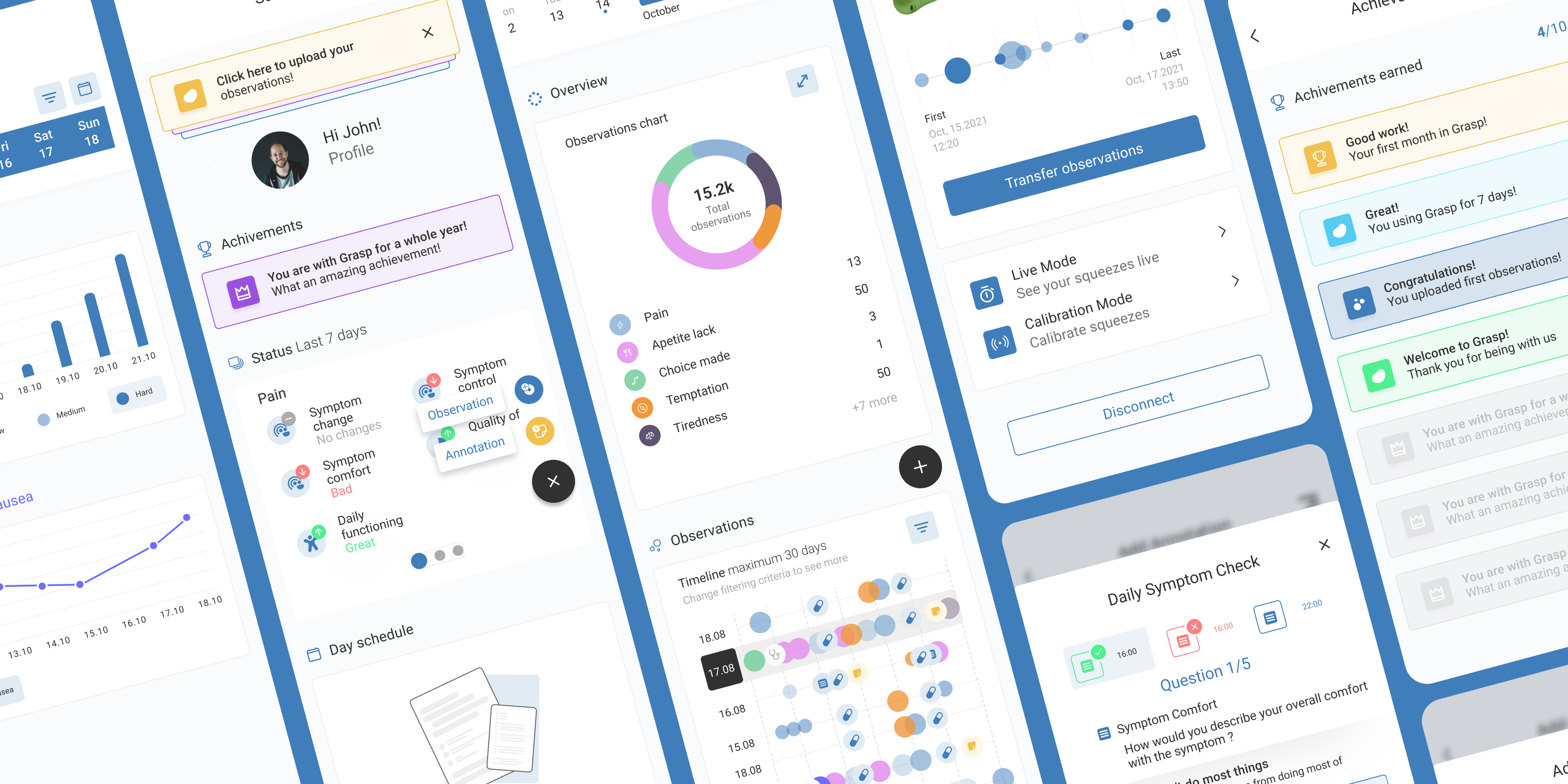
A quick look at a handful of screens from the platform. As you can probably tell, this one sits on the more technical and demanding end of the spectrum.
Overview
Open Loyalty is a web platform used by loyalty managers to build and run loyalty programs (campaigns, rewards, segmentation, points logic, and more). The product is powerful, but that power comes with complexity: dense screens, heavy configuration, and lots of edge cases.
My job was to make that complexity feel manageable. I owned improvements end-to-end: I investigated what’s not working (Hotjar, support tickets, QA findings, client feedback), shaped solutions through research and prototyping, aligned them with engineering constraints and business context, wrote UX copy with marketers and loyalty experts, and then validated the results after release. This wasn’t “designing screens” — it was continuously shipping better ways for teams to configure loyalty mechanics without getting lost.
Problems
Powerful, but hard to control
The platform offered deep logic and many options, but everyday tasks could feel overwhelming, especially for new or occasional users.
Feedback came from everywhere
Signals were scattered across Hotjar recordings, QA, client calls, CS, Sales, and internal product ideas. Without a clear process, it’s easy to chase noise instead of impact.
Shipping wasn’t the finish line
Even good solutions needed iteration. Real usage uncovered edge cases, copy gaps, and workflow breaks that only show up after release.
Opportunity
How might we help loyalty managers feel in control of complex logic — without needing to understand every technical detail?
Design work that made the platform sustainable
Not all impactful design work comes with a big visual reveal. Alongside major feature redesigns, I led a set of foundational improvements that fixed structural issues, reduced long-term UX debt, and made the platform easier to scale and maintain. The designs below focus on systems, workflows, and decisions that quietly improved how the product works every day — for admins, designers, and developers alike.
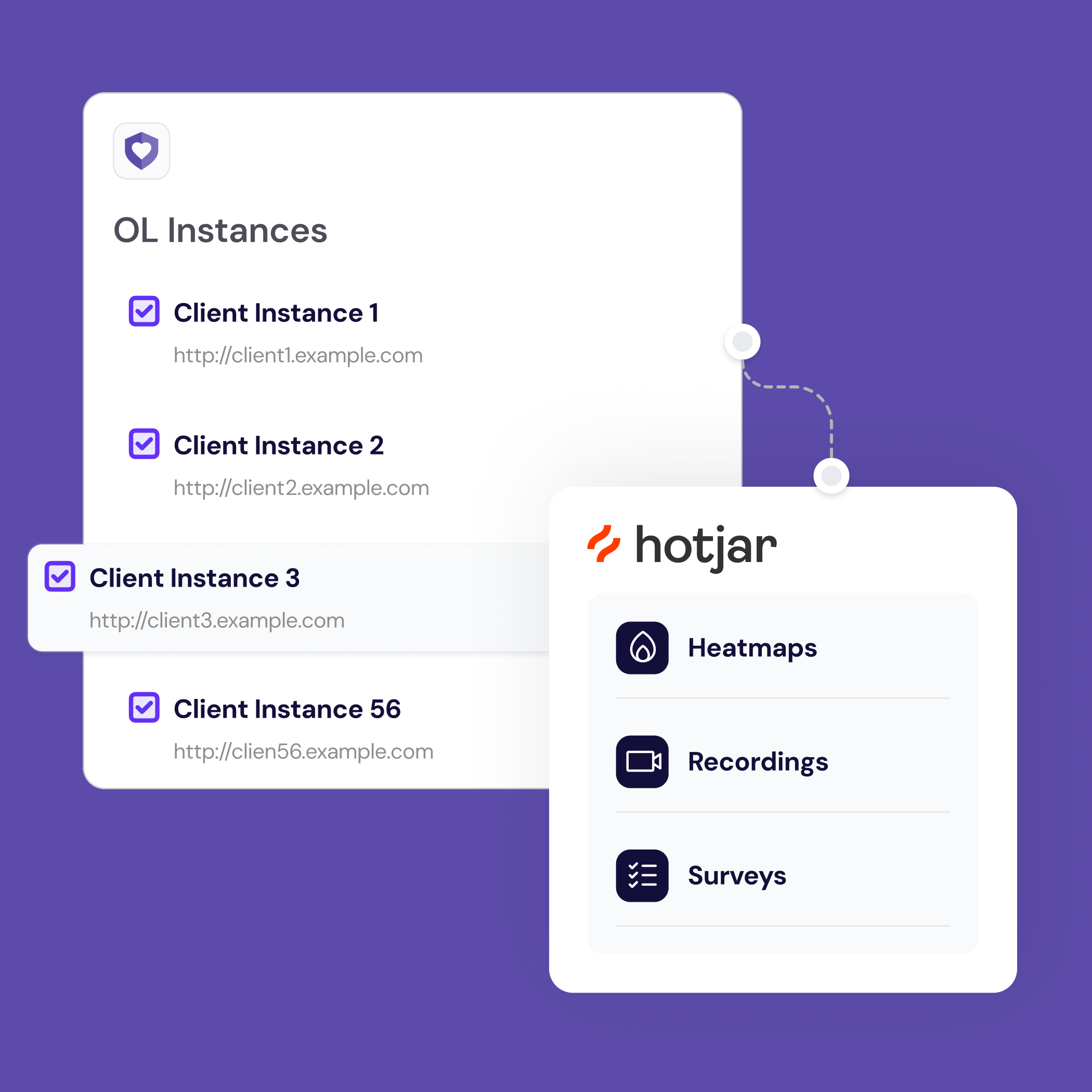
Hotjar: because assumptions are expensive
Open Loyalty is not a typical SaaS product. It runs on many separate client instances, used by large teams inside enterprise organizations. Designers didn't have one clear place to observe how admins actually worked with the product.
Before Hotjar, feedback came from demos, emails, and escalations handled by Customer Success. It was fragmented, delayed, and often filtered through several people. Designers had to rely on assumptions, memory, or meetings to understand what was really happening in the interface.
I introduced Hotjar as a centralized UX insight layer across multiple instances. Recordings, heatmaps, and in-product surveys were collected in one place, giving designers continuous access to real user behavior — without blocking other teams or waiting for feedback loops.
This made UX debt visible. We could clearly see where users hesitated, got lost, or repeated the same mistakes. It also validated when a problem was not UX-related, saving time and unnecessary redesigns.
Hotjar shifted design work from reactive fixes to informed decisions. It gave a voice to users who never contacted Customer Success and turned hidden friction into clear design priorities.
Feature redesign
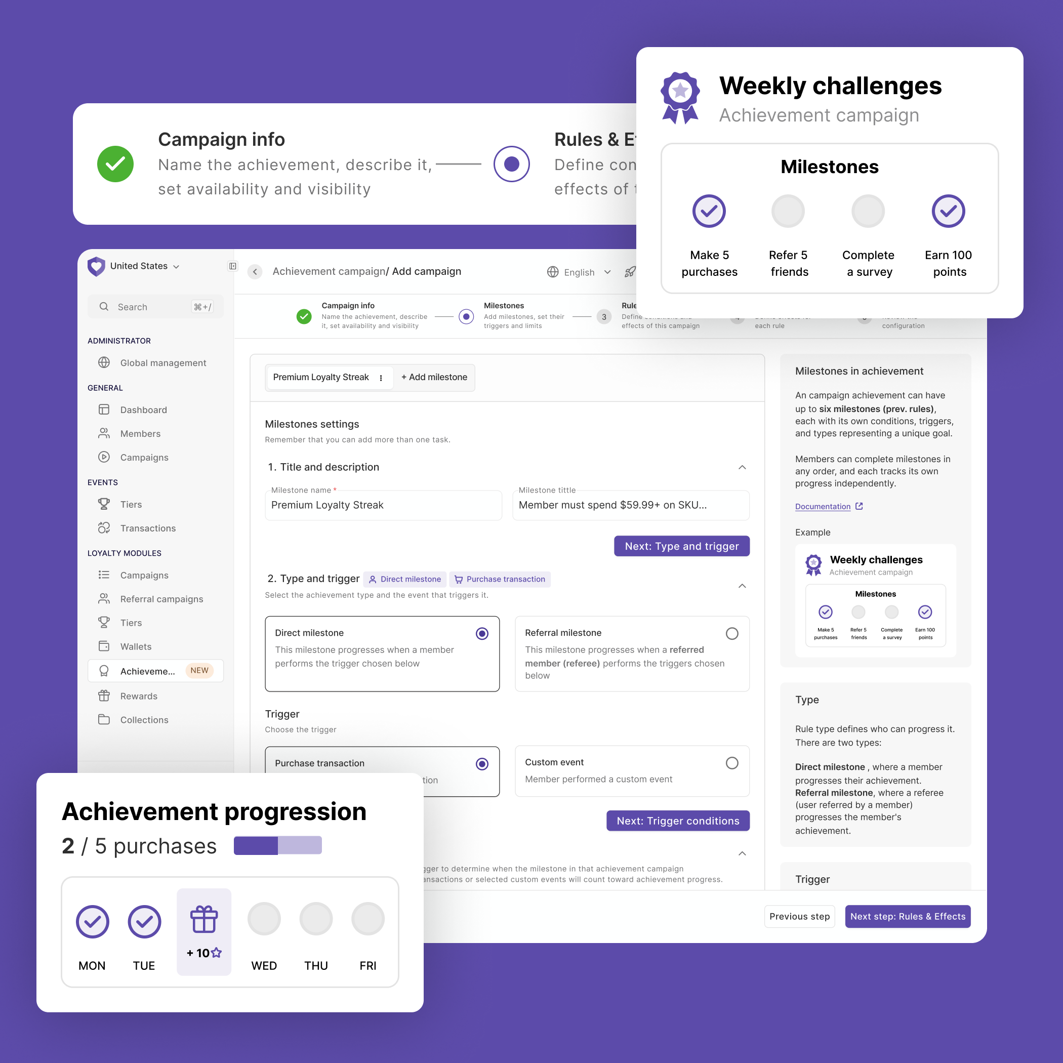
Turning a wall of options into a guided, confident experience
Achievement creation is one of the most powerful — and most overwhelming — parts of the platform. Users had to configure a full achievement setup on a single, endlessly long screen: conditions, rules, point logic, event triggers. No guidance. No hierarchy. No way to know if what you were building was even close to correct.
I redesigned the flow using progressive disclosure — breaking the single screen into a clear multi-step flow, where each step focused on one decision at a time. This alone reduced the cognitive load significantly and made it obvious where you were and what came next.
I added a persistent contextual help panel on the right side of each step — plain-language explanations of what each option does, links to documentation, and real examples. Users no longer had to leave the product to understand it.
The biggest unlock: pre-built templates with the most common achievement setups already configured. Instead of starting from a blank, intimidating form, users could pick a template that matched their use case and adjust from there. This reduced time-to-first-achievement and removed a recurring source of support tickets from clients who couldn't figure out where to start.
Fewer support requests
Achievement-related queries to the support team dropped noticeably after the redesign shipped.
Positive user reactions
Loyalty managers flagged the new flow as one of the clearest improvements in the product — directly, on client calls.
Fewer costly configuration errors
Misconfigured achievements (points awarded incorrectly, broken conditions) are expensive bugs. Clearer steps and templates reduced the chance of setting things up wrong in the first place.
Usability testing
When "powerful" becomes a problem
Expressions are one of Open Loyalty's most advanced features. They let loyalty managers define complex campaign logic using a custom rule language — think conditions like "reward this customer if they made a purchase within 7 days of registration and their tier is Gold." Instead of picking from a dropdown, you write it out as a logical expression using attributes, operators, and functions pulled from member data, transaction history, and custom events.
On paper, it's incredibly flexible. In practice, it's the kind of feature that sits unused — or gets misconfigured — unless the UX actively supports the person using it. The interface gave you a text field and not much else. No examples in context, no validation feedback that helped you understand why something was wrong, no guidance on which attributes existed or how to combine them.
To understand what was actually happening when users tried to use expressions, I ran a task-based usability test: I asked users to configure a specific expression inside a campaign — a realistic scenario, not a tutorial. The video below is a recording of one of those sessions.
Usability test recording — task: configure an expression-based condition inside a campaign.
Watching users work through the task made the friction points impossible to ignore. People understood the concept — they knew what they wanted to express logically — but the interface gave them no bridge between intent and syntax. They had to leave the product to look up attribute names. They got no signal when an expression was malformed until they tried to save. And when something failed, the error messages told them that it was wrong, not where or why.
These sessions directly shaped redesign priorities: inline attribute browser, real-time validation with plain-language feedback, and contextual examples embedded at the point of use — not buried in separate documentation.
Deliverables
- End-to-end redesigns of core workflows — including achievement creation, campaign configuration, and expression-based rule building
- Contextual help system: inline explanations, attribute browsers, and in-product documentation embedded at the point of use
- Pre-built templates for the most common achievement and campaign setups, reducing time-to-configure and support load
- UX writing for the entire admin panel — copy aligned with loyalty domain language, validated with marketers and loyalty experts
- Hotjar setup across multiple client instances — heatmaps, session recordings, and in-product surveys as a continuous insight layer
- Task-based usability test sessions with real users, including recordings and documented findings shared with the product team
- Post-release validation reports — testing shipped changes against original hypotheses and filing UI fixes where needed
What I learned
- Power without guidance is just complexity. The most capable features in the platform were also the most abandoned — not because users didn't need them, but because the interface didn't meet them halfway.
- Shipping is the beginning, not the end. Every release revealed edge cases, copy gaps, and workflow breaks invisible in prototypes. Building in time for post-release iteration isn't optional — it's part of the design process.
- Scattered feedback is not the same as no feedback. Learning to synthesize signals from Hotjar, support tickets, QA, sales, and client calls into clear priorities was as valuable as any individual redesign.
- UX writing is a design decision. Copy that matches how loyalty managers actually think — not how engineers named the field — reduced confusion more than visual changes did in some cases.
- In B2B products, the user and the buyer are different people. Designing for the admin who uses it daily, while keeping the decision-maker's goals in view, requires holding both perspectives at once.
See also
Other projects you might find interesting
🍪 This site uses cookies
I use Hotjar and Google Analytics to understand how people use this portfolio. No data is sold or shared with third parties beyond these tools.