Case study
Scaling one waste management product into multiple municipality-branded apps.
It started as a quick redesign of one outdated waste management app. You know, the classic. Then reality hit: more municipalities, more versions, different module packages, and suddenly just make it look nicer was not a strategy.
So I designed the full mobile experience for residents and turned it into an ongoing, scalable design system for Norwegian municipalities that lets each city feel genuinely theirs, not like the same template with a new logo slapped on.
Project summary
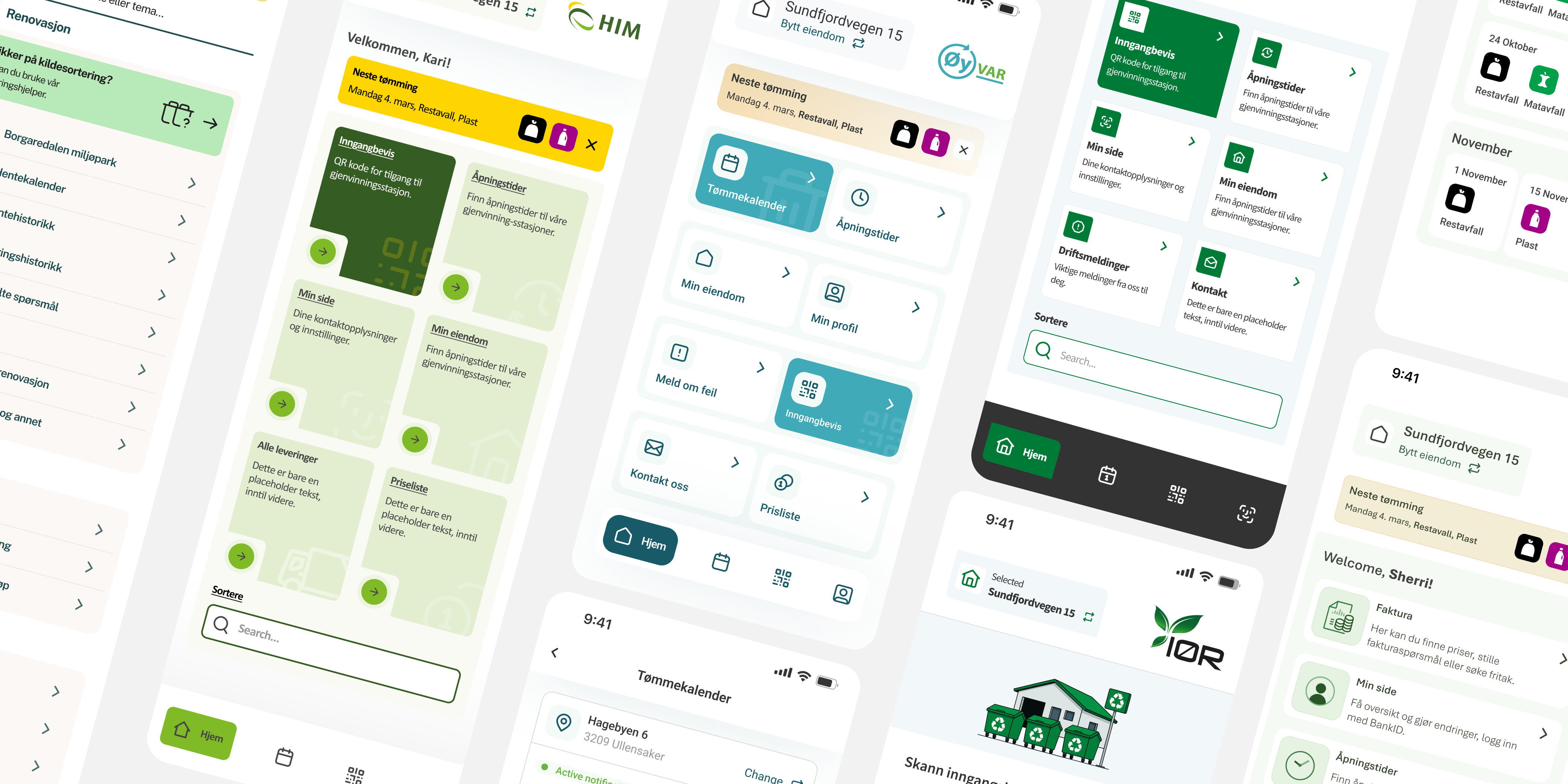
A few municipality app examples built on the same core product, each with its own look and module setup.
Overview
VSP (Norway) needed a way to roll out resident-facing waste management apps for multiple municipalities fast, without shipping "the same app with a new logo." Each municipality could also choose a different set of modules, so every app had a slightly different scope and navigation. I was responsible for the end-to-end product design of the mobile experience. During the process, it became obvious that the only way to keep quality high and delivery fast was to create a configurable design system, not as a separate "design system project," but as a direct response to the product scaling problem.
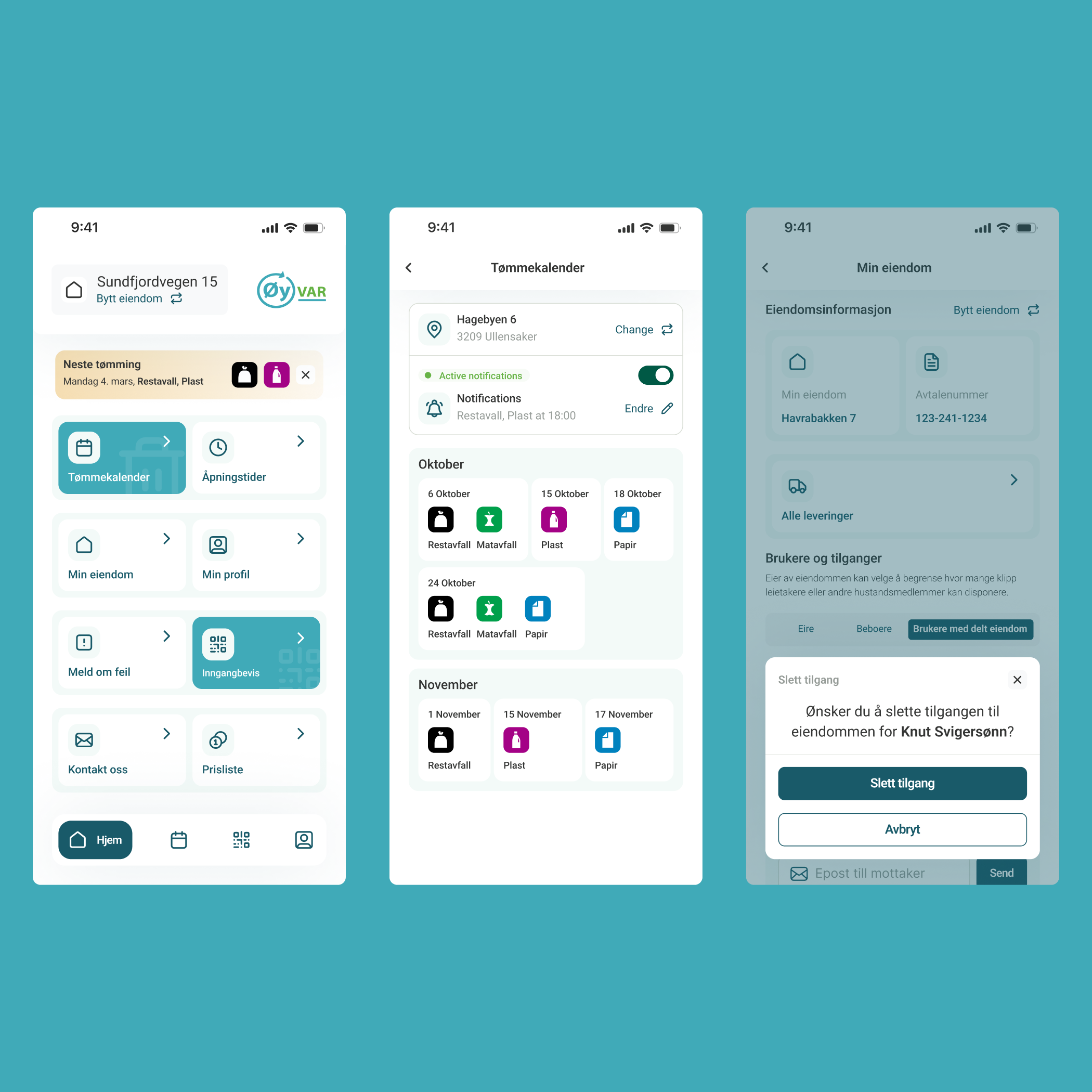
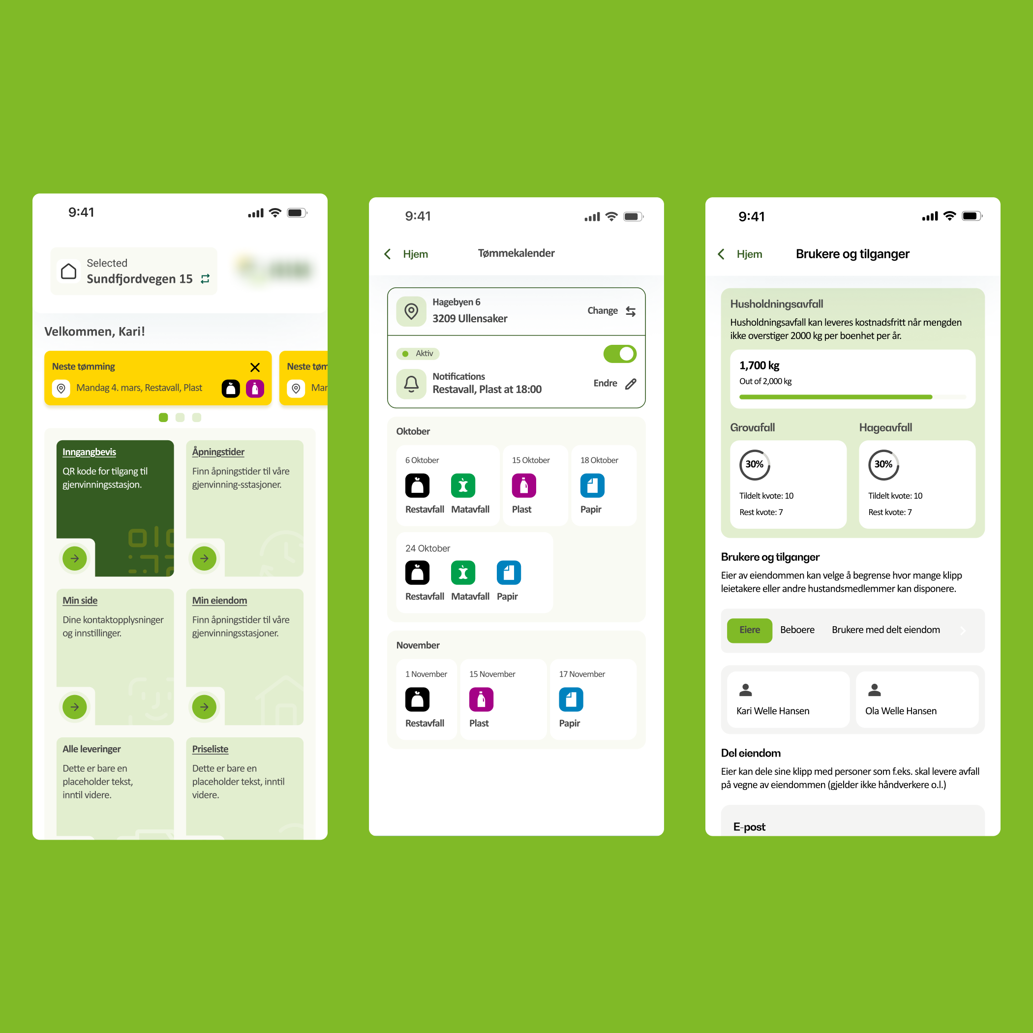
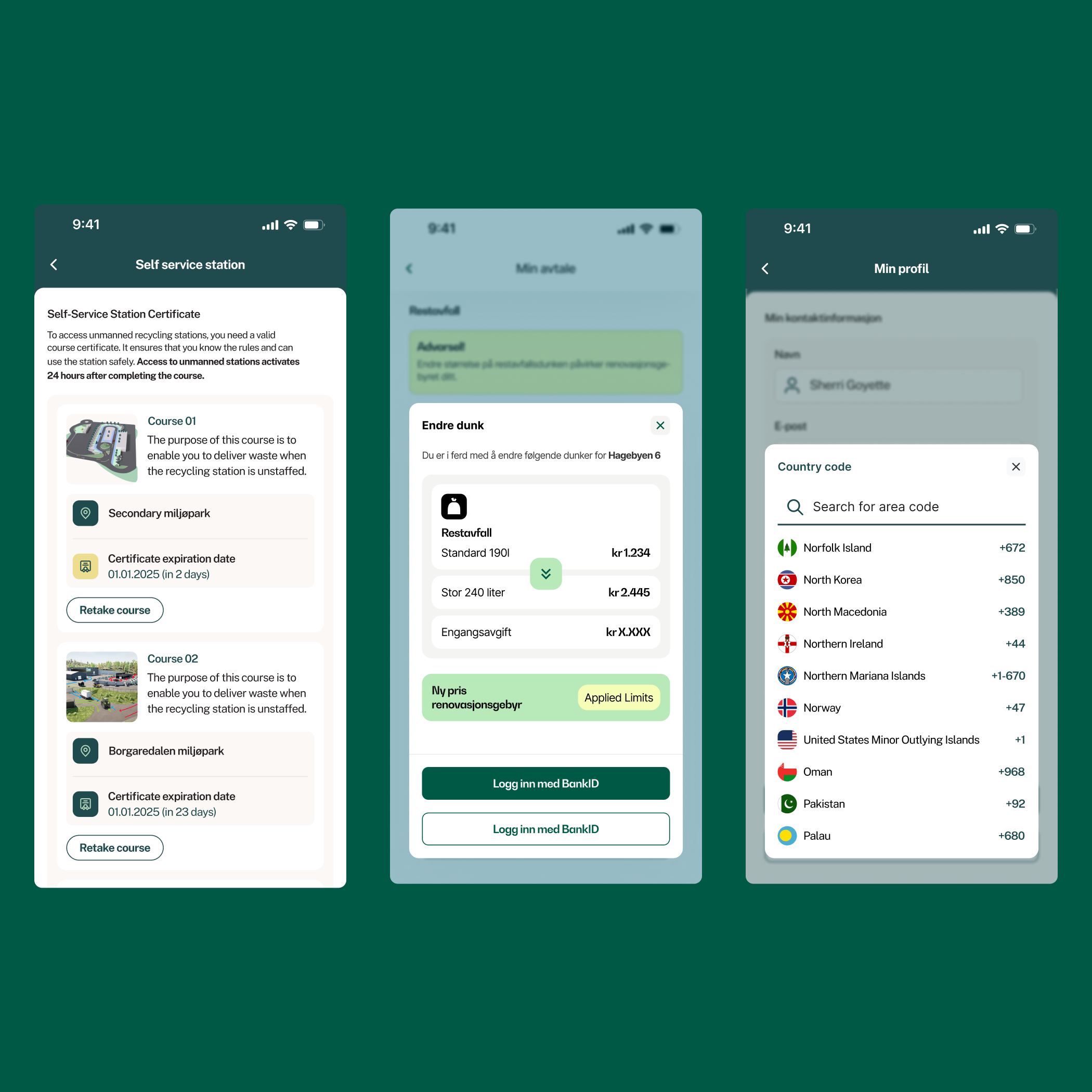
In the app, residents can quickly check what is being collected next, manage one or more properties, and share access with household members or tenants. The home screen surfaces the next pickup as a clear alert with waste-type icons, while navigation adapts based on which modules a municipality has enabled. Users can also access self-service recycling stations using a QR-based entry pass, with a built-in course and certificate flow for municipalities that require safety training. On top of that, the app includes practical local utilities like search, service shortcuts, and contact information with quick actions (copy, call, email) designed for "I need this now" moments.
Problems
Template vibes
Each municipality app should feel like it belongs there, not like a recycled template. The goal was to enable deeper visual identity beyond logos and colors, while keeping the experience familiar and trustworthy for residents.
Manual
New rollouts shouldn't mean redesigning the same product again and again. We needed a repeatable design approach that keeps quality high, speeds up delivery, and prevents inconsistencies as more municipalities come onboard.
Fragmented
Different module packages shouldn't break the experience. The goal was to keep navigation, entry points, and empty states predictable so every configuration feels complete, even when features vary between municipalities.
Opportunity
How might we make new rollouts , FAST, REPEATABLE , and not manual?
The hard part wasn't designing a nice home screen.
The hard part was designing a home screen that still makes sense when the app has a different module set, different branding, and sometimes different priorities depending on the municipality.
I designed a modular home screen so each municipality version feels complete, no matter which modules are enabled. The home acts as a hub with smart shortcuts, so the selected features always land in the right place and the app never ends up with empty boxes or awkward "something is missing" layouts. I also avoided dead ends by making sure every shortcut leads somewhere meaningful, and the structure leaves room to plug in new modules later without having to redesign the whole home again.
Flexible enough for the "special requests"
Some features were municipality-specific and existed only in a single app version. I designed the system so these one-off modules could still fit naturally into the product, using the same navigation logic, UI patterns, and content structure as the shared core.
This way, unique features didn't look like "custom add-ons" glued on top. They felt like a normal part of the app, and the overall experience stayed consistent even when a municipality had something extra.
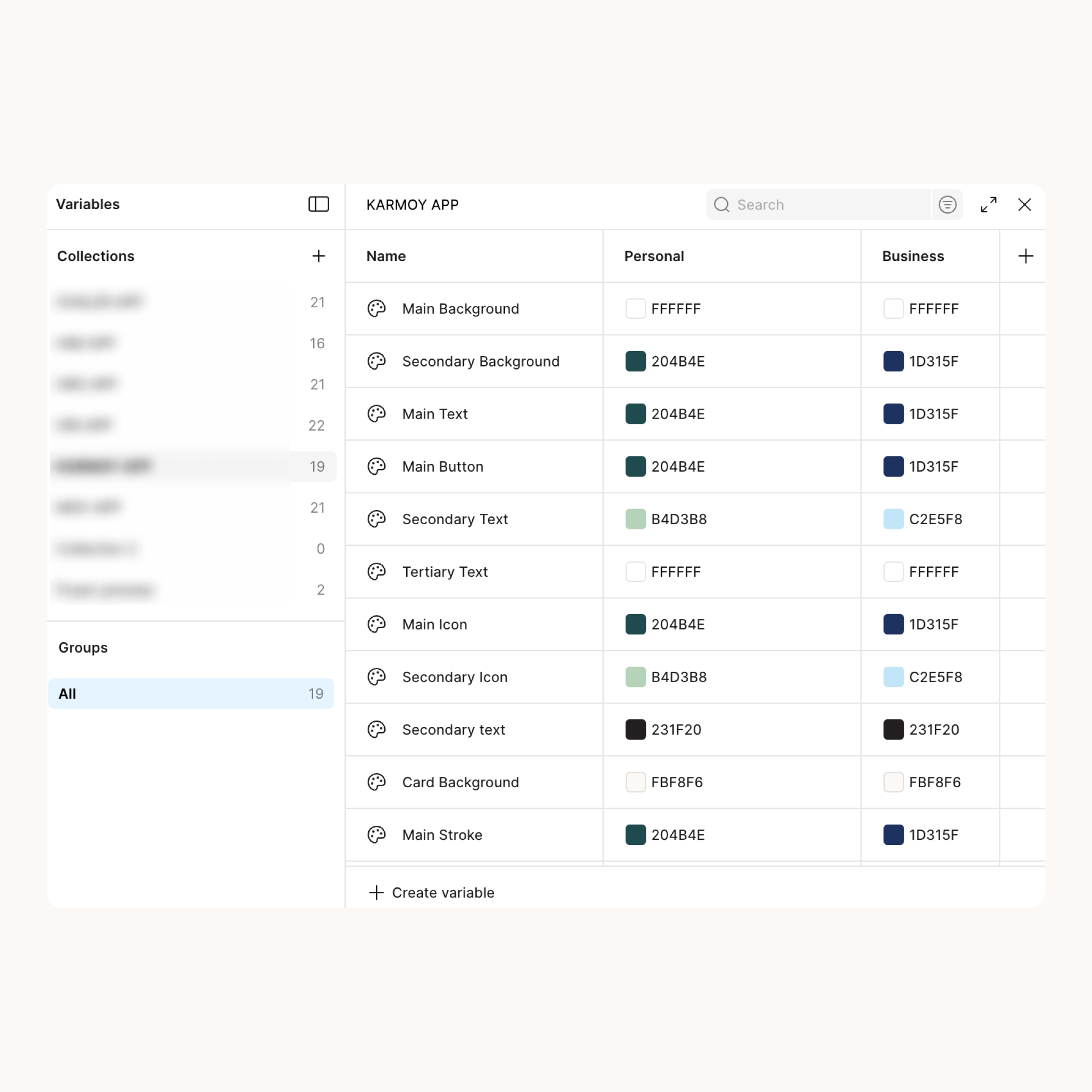
Design variables that keep rollouts consistent
This variables-based theming layer was designed to support fast municipality rollouts without sacrificing consistency. Instead of building a "beautifully complex" token universe that only its creator understands, I focused on a clear, maintainable structure that covers what actually changes between apps and protects what shouldn't.
It lets the product team apply municipality branding across the UI in a controlled way, keeps shared components consistent, and makes updates safer over time. And when another designer jumps in, they don't need a treasure map to figure out where styles live. The system is opinionated enough to prevent drift, but flexible enough to keep each municipality feeling genuinely local.
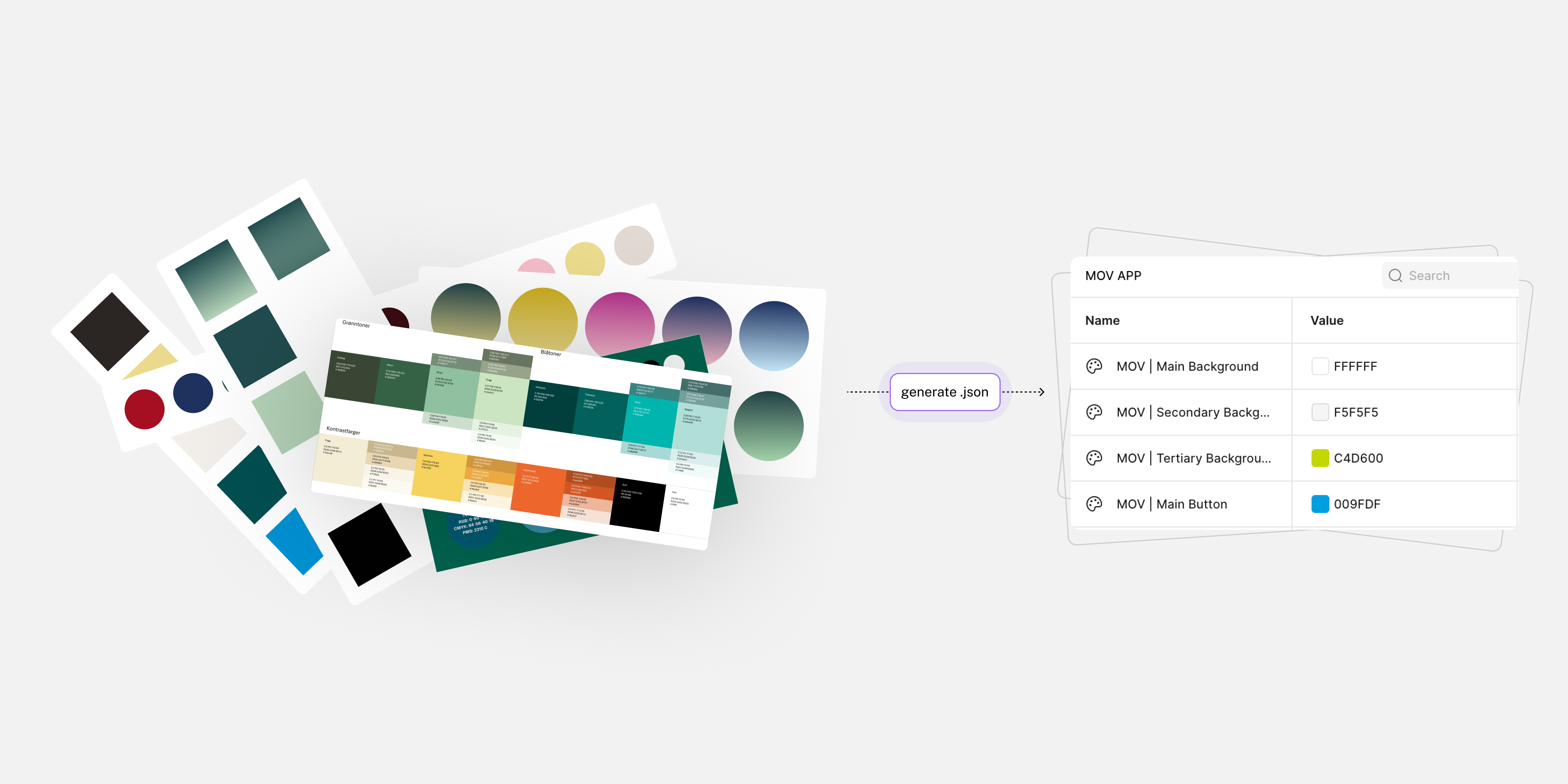
How I used AI to generate municipality color themes in a consistent JSON structure and import them into Figma
Another thing that sped up rollouts was how we handled theming. Each municipality comes with its own predefined brand colors, and the app already has a design system structure they need to fit into. To avoid rebuilding palettes manually every time, I used AI to generate color sets in a strict JSON structure that matches our naming and token conventions. We could import that directly into Figma, so naming stayed consistent across municipalities and the initial theme setup was dramatically faster. Of course, it still required a human eye for final visual adjustments, but this approach made the first pass roughly 5× faster and removed a lot of repetitive, error-prone work.
Goals
Template vibes -> identity
Enable customization beyond colors and logos so each municipality feels genuinely "theirs" while staying recognizably official.
Manual -> Repeatable
Create a scalable design approach that keeps quality high, speeds up delivery, and prevents design drift as more municipalities launch.
Fragmented -> Modular
Define clear rules for navigation, entry points, and fallbacks so the experience stays complete across different module packages.
Pilot video from the client showing how residents use the app, including QR access to the self-service station.
Deliverables
- End-to-end mobile UI for multiple municipality app versions, including core screens and module-based flows
- Modular information architecture and navigation rules that adapt to different feature packages
- Reusable UI patterns for cards, alerts, lists, empty states, and system messaging
- Municipality theming setup built with variables to support scalable white-label customization
- Handoff-ready specs and design decisions shared with the dev team to keep rollouts consistent
What I learned
- Designing the app in Norwegian (a language I don't speak) forced me to improve the UX without leaning on copy. Harder at first, better UX in the end: clearer hierarchy, stronger patterns, and more "obvious" navigation.
- Strong visual affordances beat extra instructions. If users hesitate, the UI should guide them before the FAQ has to.
- Modular products need rules, not improvisation. Navigation, entry points, and fallbacks must stay predictable across different module packages.
- Consistency across rollouts is a feature. It reduces design drift, speeds up delivery, and makes future updates less risky.
- Theming needs a controlled set of "brand levers." Customization is the point, but it has to be intentional and repeatable, not random one-off tweaks that are impossible to maintain.
See also
Other projects you might find interesting
AI-Powered Social Media Reputation Guard: Scan, Detect, Protect
Turning a complex loyalty platform into something people actually enjoy using
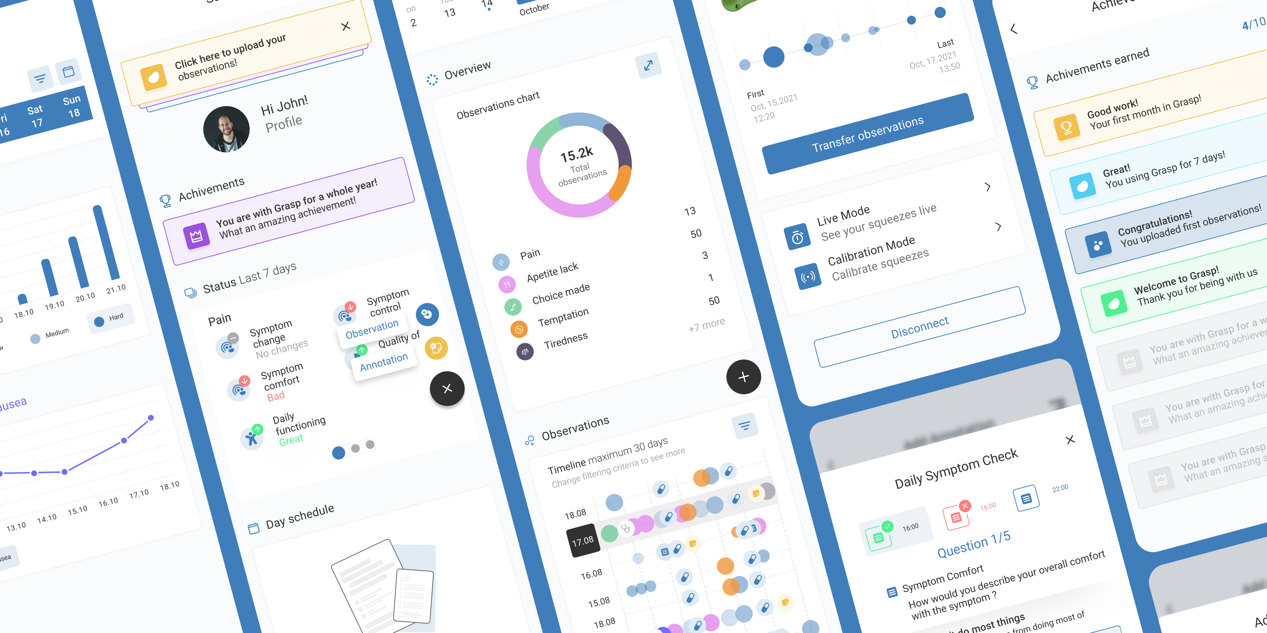
IoT HealthTech: Digitizing Pain Management with a Squeeze-to-Record Ecosystem
🍪 This site uses cookies
I use Hotjar and Google Analytics to understand how people use this portfolio. No data is sold or shared with third parties beyond these tools.