Almost everyone has social media accounts these days. Some of us have more than one account on a single portal!What are the risks of such a high presence on the web?
The problem
We publish content en masse. Sometimes that content is beyond our control. Friends and family publish photos on social media from parties, events, and situations that put us in a bad light.
Do we remember all those photos that were published 5, 10, or 15 years ago where we are tagged on?
Do we remember all our posts, comments, retweets, and shared content?
The Idea & Solution
The product in which I participated is a response to a huge market need.
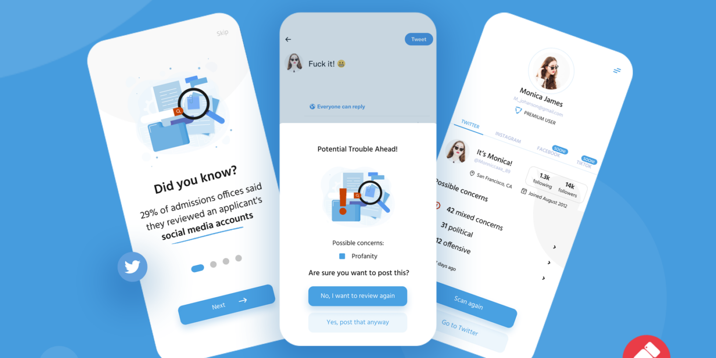
Algorithms and AI detects content in social media that is harmful, inappropriate, and potentially damaging to users’ reputation. What’s more – this app covers not only the past but takes care of the future. How?
During uploading a photo or posting a comment, Artificial intelligence checks the content before is published. If the content is inappropriate, show an alert and let the user decide.
The application is divided into two products: Web Application and Mobile Application.
The team and my role:
The design team included two designers and one UX designer.
I was a lead designer both on the Web and Mobile App.
The process.
When I joined the team, there was a published MVP version of the app. The first thing I participated in was creating the design system that will provide a consistent experience across the website, web app, and mobile app.
Design System
At that time, the company was using blue-ish colors across all products.
I decided to stick to blue but as a secondary, not the main color.
The backgrounds become white, to create bigger contrast. In my opinion, it creates more white space, where the user can focus on desired actions.
During the process of creating the design system in Figma, I created components related to the buttons, fields, validation, and more.This helps not only me but especially the React dev team. They appreciate that.
When the design system was ready, I started to create the main designs. I was working on both at the same time, preparing designs in sprints for two teams that were working on web and mobile parts.
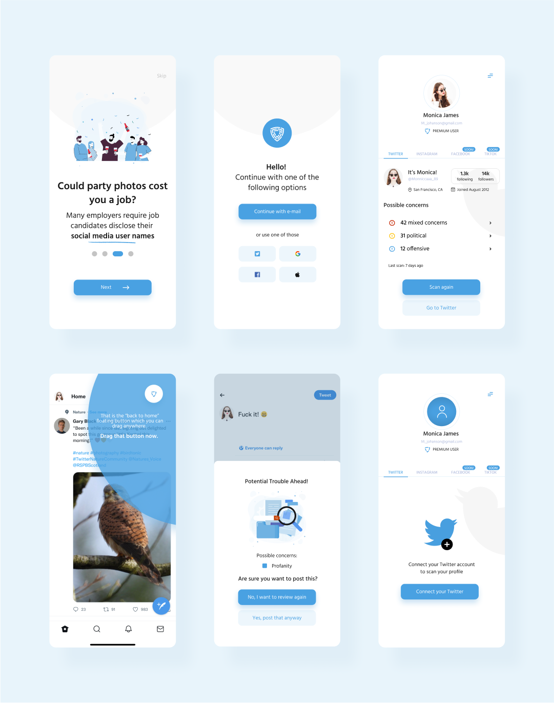
The flow is easy. Users simply register/log in with a magic link or other options like apple id, google, or Twitter. After that, they have a demo version of the app unless they subscribe. After subscribing, users gain access to linking their social media with our app.
Right now they can click scan and magic happen. The app will create a report with content that is inappropriate, grouped by categories like political, offensive, religion, and more.
Users can easily delete one by one or can select “delete all” without a second thought.
On the other hand, every time users want to post something on linked social media, the app will take care of posting content in real life.
For example, if the user wants to tweet something, hit send button and then the app scans the attached media and message.
If something is wrong – the app allows the user to change the content or delete the tweet before it’s posted!
The part of the web app is a mirror of the mobile app, with a couple of different features. This product is dedicated to the companies, brands, media houses, families, and athletic departments that want to take care of their members. This helps to monitor the activity on social media of selected groups to prevent harmful actions.
What I learn?
I become more aware of creating a Design System that is used by people across multiple teams. I also discovered the magic links. In the beginning, it was tough to design login screens, but after reading some documentation and talking with the dev team I understand how they work.

